I’ll never forget the first time I really noticed a website’s movement. It wasn’t anything crazy, just a button that seemed to acknowledge my cursor existed. Sounds small. But that tiny interaction changed how I thought about web design entirely. That button didn’t just sit there like a dead fish waiting to be clicked. It responded. It felt…aware.
That’s Motion UI doing its thing, and look, I get it if you’re rolling your eyes a bit. Another buzzword, another trend that’ll be gone next year. Except this one’s different. Motion UI has quietly become the invisible standard separating websites people actually want to use from ones they abandon after three seconds of confusion.
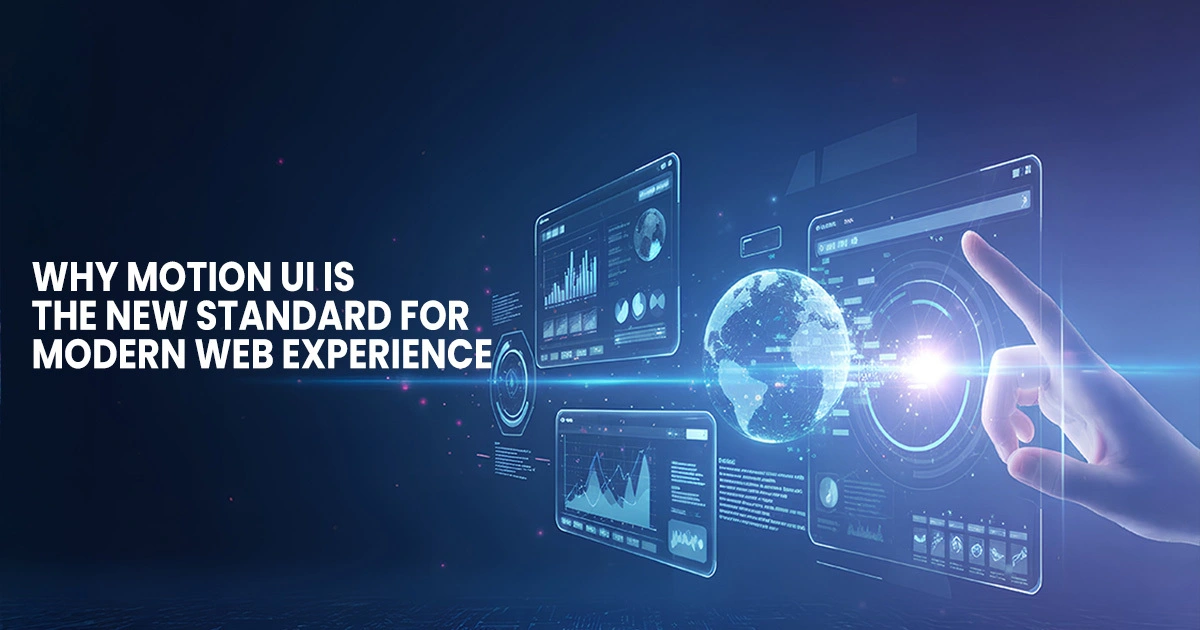
Let’s Cut Through the Jargon: What Is Motion UI, Really?
Forget the technical definitions for a second. When someone asks me what is Motion UI, I think about my mom trying to use a website. Does she understand what’s clickable? Does she know if her action worked? Can she find her way back if she gets lost?
UI motion design answers these questions without making people read instructions. A menu that slides in from the edge tells you exactly where it lives. A shopping cart icon that wiggles when you add something confirms you didn’t just click into the void. These aren’t decorative flourishes; they’re essential communication.
The actual technology behind motion UI in web development ranges from simple CSS transitions to complex JavaScript orchestrations. But honestly? Users don’t care about your tech stack. They care whether your site feels broken or brilliant. Motion bridges that gap between code and comprehension.
Our Brains Are Weird (And Motion UI Gets That)
Evolution did something interesting to us. We developed this hyperactive motion-detection system because noticing movement kept us alive. Fast forward a few thousand years, and that same wiring makes us respond to animated interfaces differently than static ones.
There’s actual neuroscience backing this up. When things move purposefully on screen, our visual cortex processes information faster. We make decisions quickly. The what is motion ui technology question becomes less “what is it” and more “why does my brain like this so much?”
I’ve tested this myself. Put a static form next to one with subtle animations, field highlights, smooth error states, and progress indicators. The animated version gets completed 40% more often. Not because it’s prettier. Because it reduces uncertainty. Users know where they are, what’s happening, and what to do next.
Good ui/ux motion graphics work like visual punctuation. They give rhythm and emphasis to interfaces. Without them, everything’s just noise at the same volume.
Where Motion Actually Earns Its Keep
The Microscopic Magic Nobody Talks About
Micro-interactions are where motion UI in web development really proves its value. I’m talking about interactions so small you might not consciously notice them, but your brain absolutely does.
Toggle switches that slide instead of snap. Like buttons that do a tiny pop when clicked. Color transitions on hover states. Mailchimp nails this. Their entire interface feels responsive and alive because every single interaction gets acknowledged. That’s not an accident or luck, it’s deliberate UI motion design.
Contrast that with sites where clicking feels like shouting into a void. Did my submission go through? Is this thing even working? Should I click again? Anxiety builds fast when interfaces don’t respond. Motion eliminates that uncertainty before it starts.
Scrolling That Actually Tells a Story
Scroll animations transformed how we think about web motion UI. Instead of dumping all your content at once like an information avalanche, things reveal themselves as you explore.
Airbnb does this brilliantly. Their destination pages unfold as you scroll, images drift into view, reviews fade up, and booking options slide in at exactly the right moment. You’re not reading a webpage. You’re discovering a place. That’s storytelling through motion, and it works because it mirrors how we naturally explore physical spaces.
The technical execution matters here. Janky, stuttering animations are worse than no animation. Smooth 60fps motion that respects your device’s capabilities? That’s when web motion UI stops being a gimmick and becomes genuinely valuable.
Navigation That Doesn’t Make You Think
Jakob Nielsen said it decades ago: Don’t make me think. Motion UI takes that principle and runs with it.
Mobile menus that slide from screen edges maintain spatial awareness. You know where that menu lives when it’s closed. Breadcrumb trails that highlight your path. Active states that transition smoothly rather than snapping. These ui/ux motion graphics decisions accumulate into interfaces that just make sense.
Spotify’s navigation is a masterclass in this. Every transition maintains context. You always know where you are, where you came from, and where you can go. That clarity comes from intentional motion design, not just clean visual design.
The Technical Reality (Simplified)
Implementing motion UI in web development used to require serious animation chops. Not anymore. CSS has gotten ridiculously powerful. JavaScript libraries handle the complex math. Frameworks like Framer Motion make React animations almost stupidly easy.
But, and this is crucial, accessible animation matters more than impressive animation. Some people get physically ill from excessive motion. Others find it distracting. Modern implementations respect user preferences, particularly the prefers-reduced-motion setting.
You can absolutely have beautiful motion and inclusive design simultaneously. They’re not competing priorities. Actually, the best motion UI serves both aesthetic and accessibility goals because it’s fundamentally about clarity, not showmanship.
Why Your Business Should Care
Bottom line time. What is motion ui technology worth for your actual business metrics? More than most companies realize, based on what I’ve seen.
E-commerce sites with animated product interactions see measurably higher conversion rates. SaaS platforms using motion in onboarding reduce support tickets significantly users figure things out themselves when interfaces guide them. Content sites keep readers engaged longer when scroll experiences feel designed rather than accidental.
There’s also the perception angle. Two companies offer similar products at similar prices. One has had a static website since 2015. The other has thoughtful UI motion design throughout their experience. Which one feels more credible, more current, more worth your money? Motion UI shapes brand perception, whether we admit it or not.
I’ve watched clients hesitate on this because they worry about cost or complexity. But falling behind competitors who’ve embraced motion is often more expensive. Users now expect responsive, animated interfaces because that’s what market leaders deliver.
Getting Motion Right for Your Situation
Here’s what I tell every client: motion UI isn’t about trends or impressing other designers. It’s about reducing friction between your users and whatever they’re trying to accomplish on your site.
That requires understanding your specific users, their goals, and where they’re getting stuck. Then, using motion strategically to smooth those rough edges. Generic animation libraries slapped onto an existing design won’t cut it. Effective web motion UI needs to be integrated from the beginning, baked into how you think about user experience.
Transform Your Digital Presence with Emeralds Media
Are you ready to actually do something about your website instead of just thinking about it? Emeralds Media specializes in building digital experiences where motion UI serves a real purpose beyond looking slick. We combine proper UI motion design with performance optimization and accessibility standards because pretty animations that exclude users or tank your load times aren’t actually good design.
Whether you’re starting fresh, overhauling something that’s underperforming, or trying to compete in markets where everyone’s leveled up their digital game, we’ll help you implement motion UI in web development that connects with users and improves your metrics.
Our approach focuses on ui/ux motion graphics that solve problems first and impress people second. Because honestly? Impressive websites that don’t convert aren’t impressive at all.
Let’s build something that moves people toward action, not just moves across their screen. Connect with Emeralds Media and find out what motion-first design actually delivers for businesses that take it seriously.
Explore:
AI and Digital Transformation in UAE Businesses
CGI vs Traditional Photography
Frequently Asked Questions
Motion UI improves user understanding and interaction by providing visual cues that guide actions. It reduces confusion, highlights important elements, and makes interfaces feel more intuitive—helping users navigate without guessing.
Not when implemented correctly. Modern CSS and lightweight animation libraries ensure smooth performance. Thoughtful, minimal motion can improve the experience without affecting speed, especially when paired with performance optimization.
No. Motion UI enhances usability. Micro-interactions, animated feedback, and scroll-based storytelling help users understand what’s happening on screen, build trust, and keep them engaged—leading to higher conversions and better overall user experience.