In the blink of an eye, before a single word is read or a tagline registered, your audience has already formed an impression of your brand. What creates that powerful, lightning-fast connection? It’s not magic; it’s color psychology.
To any enterprise keen on building a brand experience that makes a difference, one would hardly compromise on the secret, subliminal influence of colors. The art of color is the unspoken word of your business, and the art of color is the secret of successful branding and marketing. At Emeralds Media, we know that up to 90% of a customer’s initial judgment about a product is based on color alone. That’s a staggering figure that proves why strategic brand design is as critical as your business plan.
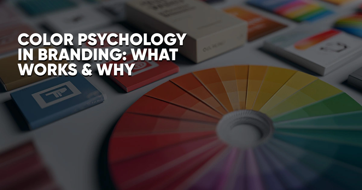
The Psychology of the Secret Language of Colors.
The psychology of colors is the study of the influence of colors on human behavior and decision-making. It is about capitalizing on the emotional and psychological connections that varieties elicit to match your brand personality and aims.
The appropriate palette is not only beautiful to look at, but it actually has a direct effect on the way human beings feel and behave. It may cause excitement, develop trust, develop a feeling of urgency, or an indication of luxury. This renders the marketing of color psychology a very crucial element of a good strategy.
Below is a better glimpse of what some of the strongest colors of branding and marketing actually convey:
Blue: The Anchor of Trust and Security
Blue is the universally popular color that happens to be liked by all people across the world, and there exists a good explanation behind this. It reminds one of stability, wisdom, and security.
- What it can be utilized in: Financial institutions, technology, and healthcare providers. Just consider large banks and social media companies, they are all smacking blue with the message of, we are trustworthy and you can trust us with your information (or money).
- The Psychological Win: Blue appeals to the head, and it brings clarity and serenity. It is a reassuring influence that creates a base of trust.
Red: The Stimulus for Action and Urgency
Red is the ultimate attention-seeker. It is a very heartfelt, cozy color that has connotations of passion, vitality, and urgency.
- What it is used in: Fast food, retail sales, and brands that desire to portray power and enthusiasm. That is why all red during a sale, it literally stimulates impulse buying.
- The Mental Victory: Red arouses the body and brings excitement. It is an action color, and it is ideal to use in your Buy Now buttons and time-sensitive deals.
Yellow: The Burst of Optimism and Joy
Yellow, like the ray of sunshine, is warm and joyful and optimistic. It is naughty and vibrant, and it is usually employed to draw quick attention.
- What it is used on: Family-friendly brands, fun services, and those companies that need to seem affordable and friendly. A smileful experience is easily conveyed by the golden arches of McDonald’s, which are iconic.
- The Psychological Win: Yellow appeals to our imagination and brings a feeling of happiness. Too much is however a red flag (see taxi cabs and warning signs), so it is better placed as an agreeable accent.
Green: The Essence of Growth and Harmony
Green is very closely associated with nature, health, and calmness. It is the color of a sustainable and thriving brand and marketing.
- What it is used in: Eco-friendly brands, health care organizations, and financial organizations that desire to convey growth and prosperity (money is green, right?).
- The Psychological Win: Green fosters a feeling of equilibrium and peace that customers feel safe about an in-store purchase that is either healthy or responsible.
Purple: The Aura of Luxury and Creativity.
Traditionally, purple is a royal color, which symbolizes wisdom, sophistication, and creativity. It is luxurious in nature and may be very unique.
- What it is used on: Luxury beauty products, creative markets, and brands with a more high-end, usually female, audience.
- The Psychological Victory: Purple is quite an uncommon color, which gives it a sense of secrecy and uniqueness and enhances the design of a brand.
The Context is Everything: Consistency and Appropriateness
Although it is critical to know the meaning of individual colors but the real art in colors and brand is best in two main areas, namely, context and consistency.
- Context is Queen: The color meaning is not universal; it is whether the color will suit your brand. Studies indicate that customers make a better judgment on a brand based on the perception of the color as a suitable match to the product or service. Red will be working with the dynamic personality of Coca-Cola, but will not suit the name of the Spa brand, whose emphasis is the luxury.
- Be Consistent: After selecting the colors, you now need to be consistent with all of them throughout each of your touchpoints, in your logo, on your site, on your packaging, in your social networks, and in your physical environment. It is this kind of consistency that shoots brand awareness by up to 80 percent-to get your corporation known and recognized instantly and memorably, just the way Tiffany is known by its unique robin’s egg blue.
The Next Step to Brand Designing.
The online world is highly competitive, and you only have a few seconds to create an impression. This is why, when wisely used to create a color psychology, you can cut through the noise and create a deeper and more emotional connection with your audience.
Do not simply choose any color you prefer, but instead, select the color that reflects your mission and one that fits the expectations of your audience and fits the experiences you wish customers to have with your brand.
Read More:
Top 10 Upcoming Games of 2026 and Beyond
Corporate Events Planning in the UAE: A Complete Guide
Frequently Asked Questions
1. What is color psychology in branding?
Color psychology in branding studies how colors influence emotions, perceptions, and buying behavior. The right color palette helps create instant connections, build trust, and shape how customers feel about your brand.
2. Why are colors so important in marketing?
Up to 90% of a customer’s first impression is based on color alone. Strategic color choices can spark excitement, inspire confidence, or communicate luxury—making your brand more memorable and persuasive.
3. How can I choose the right colors for my brand?
Select colors that align with your brand’s personality and audience expectations. For example, blue conveys trust, red drives action, and green signals growth. Consistency across all touchpoints strengthens brand recognition.